
British Stamps
Student Creative Process Project ~ Tutor's development
Student Creative Process Project ~ Tutor's development
As a lecturer on a Graphics Design course and Head of Creative Thinking, I wanted to help my students understand some of the fundamentals of being a creative graphic designer. This was aired in the class as a willingness on my part, to participate in the second semester project development. This was for two purposes. The first was to show the students the practical aspects of developing any project. Those being deadlines, process, and development in a technical fashion. The second being the method by which you can get out clever or creative ideas, or both, within the scope of any given brief.
The first project for the second semester was British Stamps. The notion being that the students pursue some research into what is Britishness. In which the research would develop ideas and inspiration to clever manipulations of the ideas to be developed for the stamp. The need was also to avoid anything that could be constituted as being cliche, obvious or too simple. As the course is creative thinking, there is a need to dig a little deeper into the briefs. To look for a more unique and original way to present the concepts.
The first stage was to achieve four Mood Boards. These would act as inspiration for the four individual stamps themselves. The mood boards had to be A3, but I gave lenience in letting the students do them digitally. What was suppose to be gained from the mood boards, was a sense of what was likely to be creatively achieved from the idea path.
In addition to this several resource elements were needed to be found:
• The Queen's head in vector format, for use in the stamp design.
• A template stamp pattern, even if developing a none standard shape.
• A dingbat font that had the post mark icons available in it.

This is the first mood board for the development of the project. The theme is Oolong tea, from China. Through the search for inspiration and moods, there was an analysis of such things as landscape, culture, art and patterns. Presented here are some of the better images found.
- technically, the board was made digitally.
The method was simply applying images into Photoshop and erasing their edges.
The border was a simple mask with layer effects of inner glow and inner shadow applied.
To compliment the mood board, an image of a Oolong tea plant was found and added to the corner.
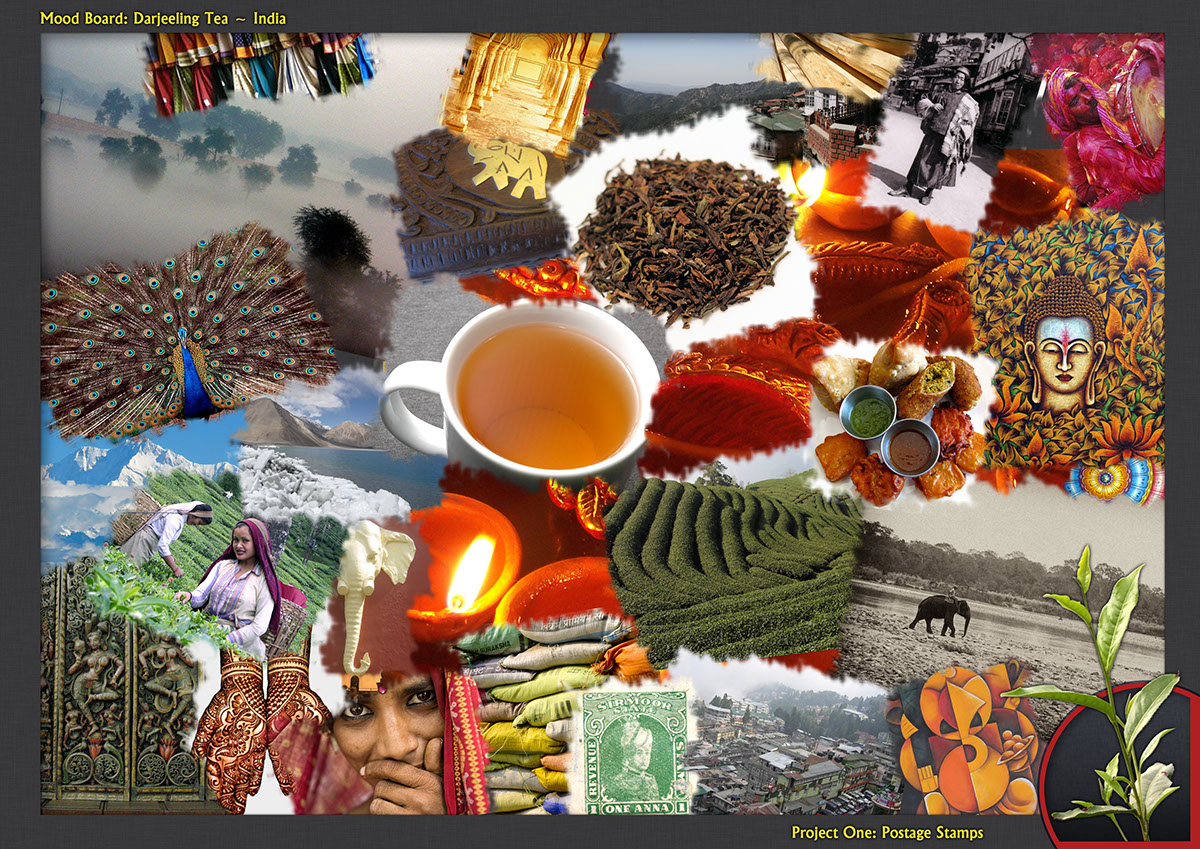
This is the second mood board for the development of the project. The theme is Darjeeling tea, from India. Through the search for inspiration and moods, there was an analysis of such things as landscape, culture, art and patterns. Presented here are some of the better images found.
- technically, the board was made digitally.
The method was simply applying images into Photoshop and erasing their edges.
The border was a simple mask with layer effects of inner glow and inner shadow applied.
To compliment the mood board, an image of a Darjeeling tea plant was found and added to the corner.

This is the third mood board for the development of the project. The theme is Rooibos tea, from India. Through the search for inspiration and moods, there was an analysis of such things as landscape, culture, art and patterns. Presented here are some of the better images found.
- technically, the board was made digitally.
The method was simply applying images into Photoshop and erasing their edges.
The border was a simple mask with layer effects of inner glow and inner shadow applied.
To compliment the mood board, an image of a Rooibos tea plant was found and added to the corner.

This is the fourth mood board for the development of the project. The theme is Sencha Fukuyu tea, from Japan. Through the search for inspiration and moods, there was an analysis of such things as landscape, culture, art and patterns. Presented here are some of the better images found.
- technically, the board was made digitally.
The method was simply applying images into Photoshop and erasing their edges.
The border was a simple mask with layer effects of inner glow and inner shadow applied.
To compliment the mood board, an image of a Sencha Fukuyu tea plant was found and added to the corner.

As part of the development of the project and a crucial part of the research of the project, it was necessary to find several elements to aid in the completion of the project. These included a dingbat font that had the post mark effect as the letter forms.
It was left to the students to seek this font and to download it.
The font discovered was called "Dead Letter Office" and can be downloaded here!

The second resource that needed to be discovered was a vector version of the queens head. It has been communicated to the students the importance of the need to find vector forms of most resource necessities. Mainly for their resizable aspects to the files.
The Queen's head was found on the first Google search and can be downloaded here!

The third item that was needed to be researched was a template stamp outline, like the one above.
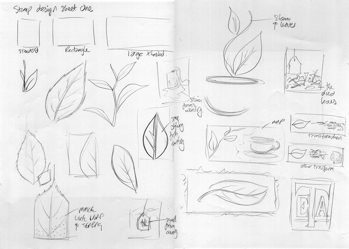
The next stage of development was to create sketched thumbnails of the theme chosen. this was intended to explore the possible solutions available for the delivery of the final outcome. The minimum sketch sheets was to be 4-5.
These sketch sheets show a lateral exploration of the notions of tea, cultures, accessories, forms, methods and shapes. Through this several ideas were generated and the following four sheets were developed.
*It's worth noting at this point athat on this first sheet the final solution was discovered, very early on (top middle), but the need to look for possible alternative solutions is necessary, as a better idea could form.

On this second sheet there was an exploration of the typography, as there is a common simplicity in the term 'tea' and the letter 'T'.

As the process continued, many angles were explored, involving simplicity and shapes as well as cultural identity.

The final sheet actual confirmed the idea of using the maps as a element in the final design.


